Preamble: Hi, I am Nathan, a professional still and event photographer based in Tuskuba, Japan. My bread and butter is audio, photo, and jewellery products, but I get to hobnob with audiophiles, foreign dignitaries, and renovating staff at hotels I shoot. I love raisins, cyclocross bicycles, and dungeons and dragons. You can find some of my work at my blog, at 500px, and at Instagram.
Fujifilm X-H1 vs. Leica SL – Basic Handling
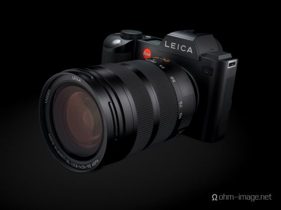
The SL’s clean layout, spacing, and focus on simple UI evidence that Leica’s design wasn’t simply to make an upscale mirrorless camera. The SL was meant to be used, to be rough-handled, and, in weather both hot and cold, reliably fiddled by skin and by gloves. Prior reviews pouring in in late 2015, and handling reports from fans, detractors, and ambassadors alike, it was obvious that the SL stood for utility hitherto mirrorless cameras hadn’t.
Since purchase, the SL has been the backbone of my architectural, event, and high-image magazine business. What concerns me about it is that it is a professional body whose professional support, be that through accessories, lenses, or service/sales outlets, is slim. If anything went wrong with anything, or if I broke, lost, or had stolen an important item in my SL bag, where would I turn?

As I described in the following article, the SL is something of a miracle. Instant ohmage – Leica SL’s haptic miracle
I’m heading to California for a headphone event called CanJam 2018 SoCal primarily to meet clients, and then to trot up the coast to Ukiah. There I will pick up furniture designed and made by my father. It has been shipped from Sweden, to Denmark, to the USA, to Canada, and back to the USA. Its next destination is Japan. It’s an important part of my inheritance, that describes in material the core of who I am.
I’m a traditionalist, both culturally and materially. Life is a paradox, especially considering that I shoot the latest audio and photo gadgetry for a living.
Traditionally, I leave my professional gear home when making trips whose primary goal it is to meet with, rather than shoot at, clients. Last year I side-graded to a Fujifilm GFX / Actus Cambo GFX from a Hasselblad CFV-50/c / Linhof M679cs, about which I made the following videos:
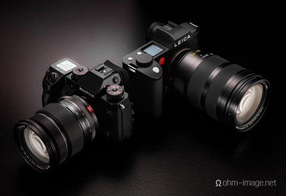
A few weeks ago I picked up a Fujifilm X-H1, principally because its top-mounted LCD and grip reminded me of the SL. Secondarily, it and its best medium zoom are light, compact, and relatively inexpensive. My owning both somehow made the rounds. I say somehow because my blog is far from foundational among camera geeks. Whatever the case, a number of people have asked how I liked the X-H1, and how it stacks up vis-a-vis the SL.
Video Parts 2 and 3 will attempt to tackle graphic UI, EVF, LCD, and UI clutter; and autofocus, lens, basic ISO performance, respectively. For now, I can only say that, at least as it regards basic utility in the hand, the X-H1 is a far cry from the simplicity, rigidity, and material feel, let alone attention to detail that the SL is. Could Fujifilm design and manufacture a camera which is as simple, clean, reliably utilitarian, and solidly built for all weather as did Leica? And if they could, how much would it cost?
Fujifilm’s designs are functional to be sure, but often require at least one, if not two, alternate steps to do a single exposure-related task. The worst offender is the shutter speed dial, which relegates third stops, exposures longer than half a second, and electronic speeds, to a secondary dial, and/or behind the T setting. Certainly as it regards the basic X-series ethos of ‘direct controls’ it is psychotic design. And, it fouls almost every camera in the X-series, starting from the X-E series, and finishing at to the GFX. Price points from 1.000$ to 5.500$ describe the same thing. Every Fujifilm camera bristles with buttons, some chintzy, most too small. Often, important functions are jammed up against competing or correlating functions. The X-H1’s AF-ON button, which sits in a recessed valley far from the tiny joystick nipple, is one example. Its direction pads, which are so flush that even through bicycle gloves, are hard to press, are another. Its shutter button is so light that even my wife’s light fingers forced hundreds inadvertent exposures from the camera.
Fujifilm’s colour science is great. Many of their lenses are top tier. But their interfaces are designed by committee. And yet I keep coming back, hoping, perhaps stupidly for reform. Despite my critical and incessant bleating, I support Fujifilm, but to think that they are the Japanese equivalent to Leica, or that their interfaces are truly direct and/or simple is blind, if not ingenuous.
I hope that this first video will demonstrate what my words could and can not.
If you have an interesting idea for a guest post, you can contact me here.


